

Working on the cutting edge of disruptive technologies? Getting access to exclusive massive datasets? Contributing to the most exciting field of our times? Whatever your reason to get into the Data Science industry is, in this blog post I’m going to tell you how I mastered my technical interviews and landed my data scientist position at Tagup.
Emerging businesses in the field of Predictive Maintenance have experienced incredible growth over the past several years, driven by exponential increases in data availability and new computing technologies. Consequently, landing a position in a relative small company today might turn into a fast career growth trajectory in just a short period of time. However, competing for such a role involves tackling several challenges where the technical rounds seem to be the most difficult and perhaps the most dreaded part of the entire interview process. Indeed, just solving these problems is often not enough to stand out in such a competitive landscape, which is why an outstanding presentation of the solution is as important as applying the best algorithmic tools.
In the following sections I’ll present an autoencoder-based approach to the anomaly detection problem that I leveraged during one of the technical rounds as part of my interview process at Tagup — notice that all the code, figures and explanations in this post were an integral part of my submission.
This post assumes some background in basic signal processing and machine learning.
Table of Contents:
- The anomaly detection problem
- Autoencoder for anomaly detection
- Data cleaning
- Data formatting and normalization
- Training the autoencoder
- Performance evaluation and decision logic
- Conclusion
The Anomaly Detection Problem
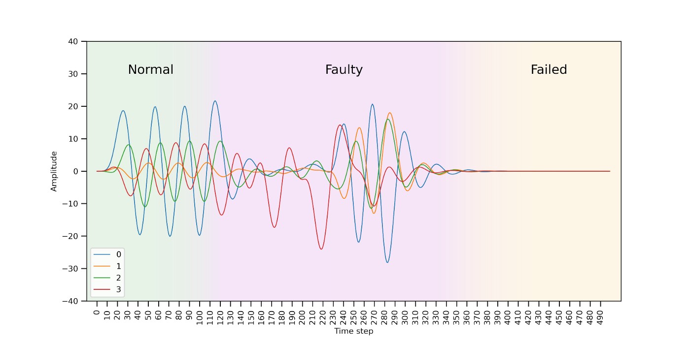
Imagine a company running a fleet of very expensive machines (i.e., a set of wind turbines) having three operating modes: normal, faulty and failed. The machines run all the time, and usually they are in normal mode. However, if a machine enters faulty mode, the company should take preventive actions as soon as possible to avoid the machine entering failed mode (which would be detrimental not only to the machine but also very costly for the company).
Each machine is monitored through a set of sensors streaming data in real-time. Figure 0 shows an example of the data coming from a single machine during the different operating modes. When a machine is operating in normal mode, the data behaves in a fairly predictable way. Before a machine fails, it ramps into faulty mode where the data appears visibly different and unpredictable. If operating in faulty mode, the machine will eventually break with all signals going close to zero (failed mode). Since the breaking point is unpredictable, the goal is to be able to spot faulty patterns and shut down the machine as soon as possible.
Autoencoder for Anomaly Detection
The solution proposed is a self-supervised approach to detecting faulty patterns using a model architecture from a class of deep learning models called autoencoders. This approach roots itself in the observation that, while normal behavior is fairly predictable, faulty patterns deviate from this predictable behavior.
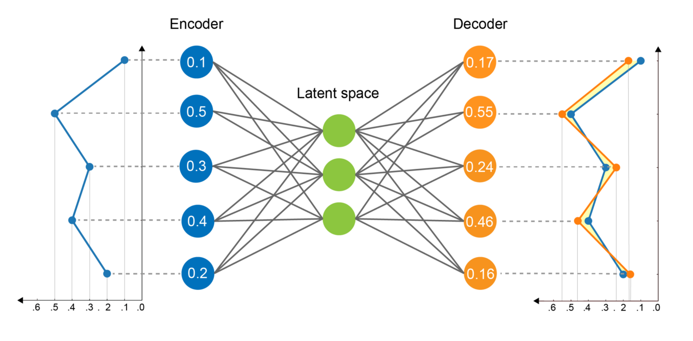
In essence, autoencoders are composed of two networks: an encoder and a decoder (see Figure 1). The encoder network encodes the input sequence into a smaller dimensional space called the “latent space”. The decoder network tries to reconstruct the original sequence from the latent encoding. The autoencoder has to learn essential features of the data to be able to do a high-quality reconstruction during the decoding step. The difference between the input sequence and its reconstruction can be quantified using an error measure, i.e., the Mean Squared Error (MSE).
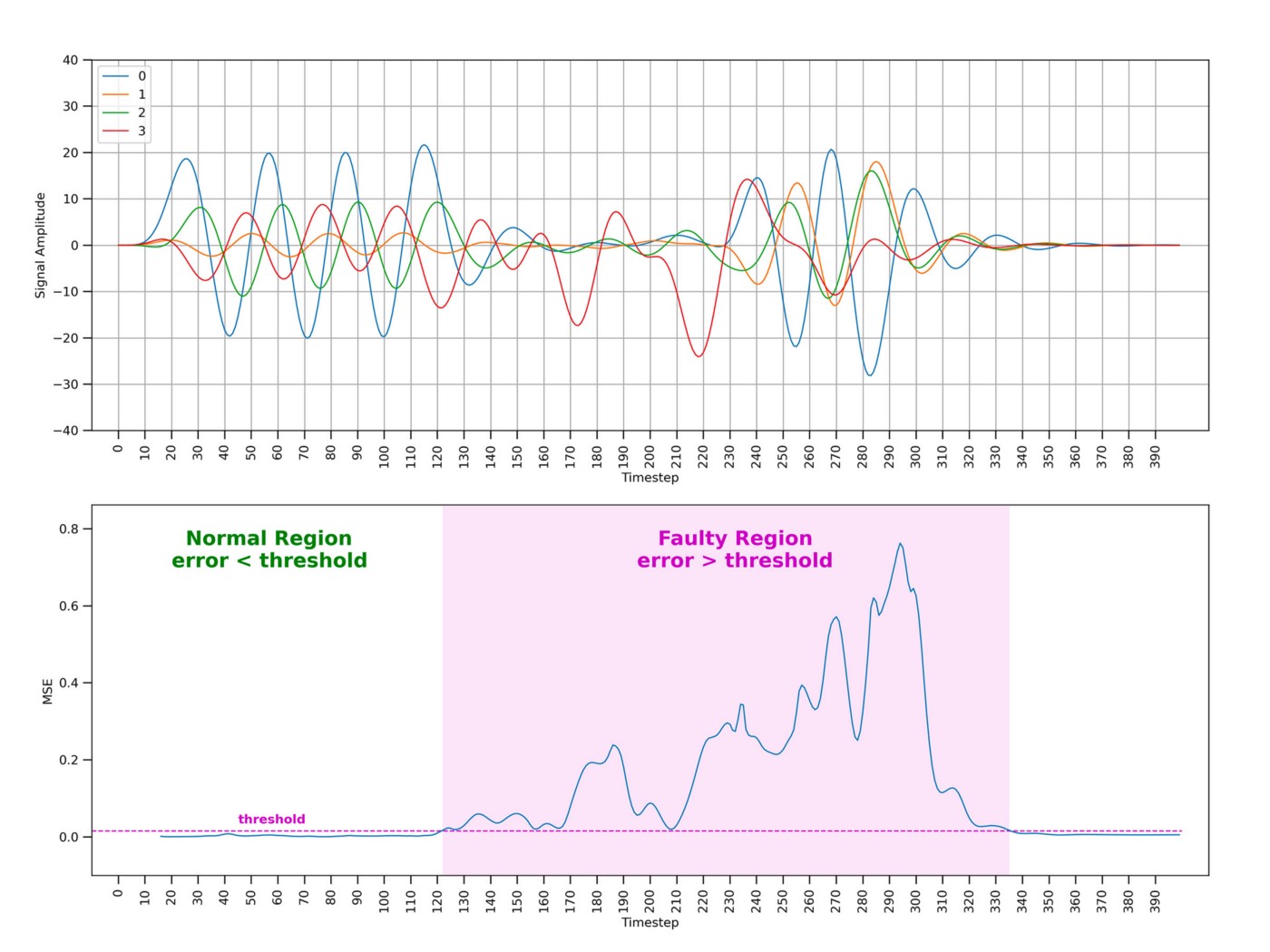
After being trained on sequences of fixed length showing normal behavioral patterns, the autoencoder is expected to be able to reconstruct other unseen normal sequences fairly well (e.g., resulting in low error values). Instead, when a faulty sequence is provided as input, the autoencoder would struggle to make a good reconstruction resulting in a high error value. Once put to work, the autoencoder observes the real-time sensor data within a time window of the same length of the training sequences. A threshold mechanism on the reconstruction error is then used to discriminate the different behavioral patterns. The animation in Figure 2 provides a visual intuition of the solution’s mechanism.

Data Cleaning
The time series data shown in Figure 0 and Figure 2 already went through a cleaning process allowing to reduce the variability in the data that will be used to train the autoencoder. So, let’s rewind for a moment and see how this result was actually achieved.
Figure 3 shows a sample of the raw time series data. In the following snippets of code I will assume the input data to be in CSV format with each column constituting a different signal.
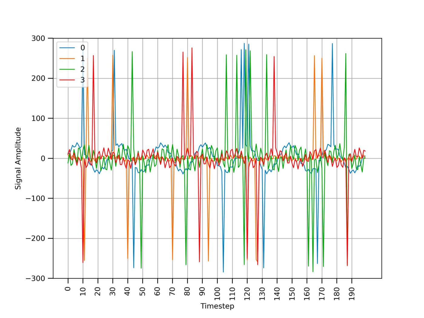
As visible in Figure 3, the time series data presents 2 main problems:
- Signal spikes due to sensor communication errors;
- High-frequency noise (e.g., the signal looks like a “zigzag”).
Signal spikes can be removed using a simple threshold mechanism. Snippet 0 shows how to spot the signal portions having an amplitude greater than a fixed threshold (in absolute value) and replace them with the closest previous value using common Python packages.
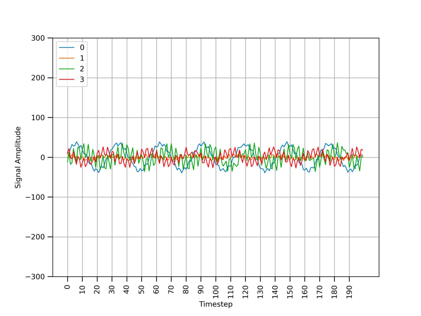
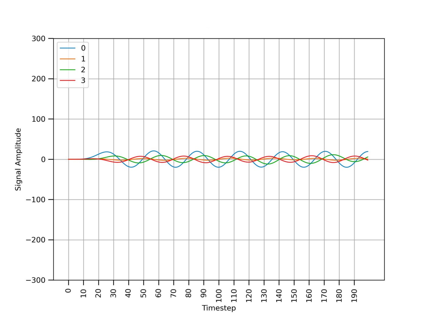
Figure 4 shows the same signals from Figure 3 after removing the spikes due to sensor communication errors. The high-frequency noise is still present.
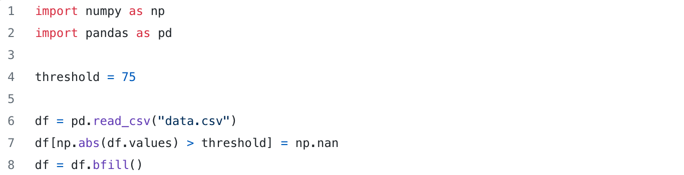
Figure 4 shows the same signals from Figure 3 after removing the spikes due to sensor communication errors. The high-frequency noise is still present.
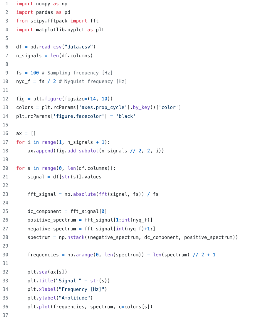
Removing the high-frequency noise can be easily achieved using some basic filtering techniques. However, in order to properly set the filter’s parameters, visualizing the signals in the frequency domain would be very informative. Snippet 1 shows how to use the SciPy Fast Fourier Transform (FFT) to plot the signals’ spectrum shown in Figure 5.
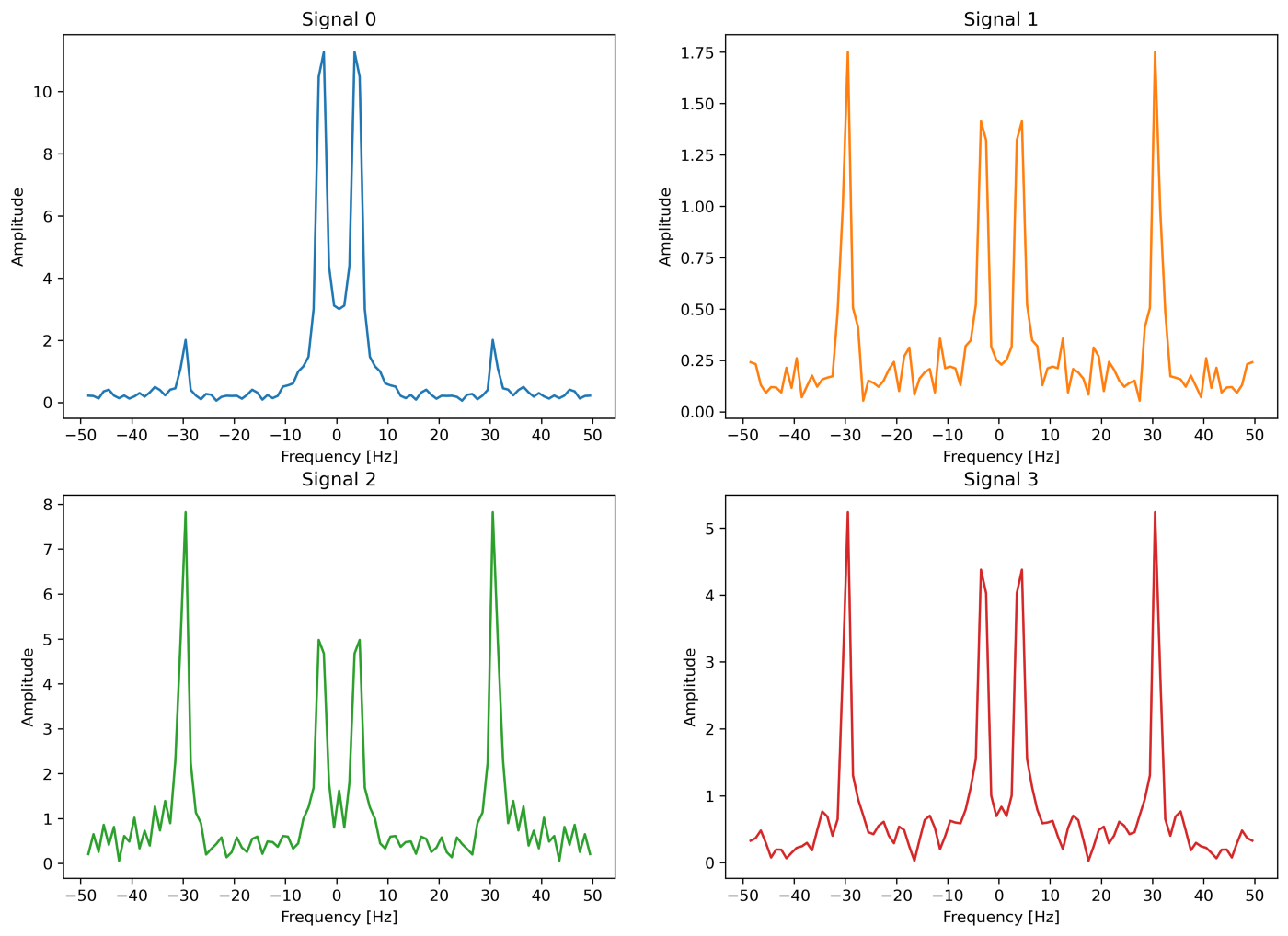
It is possible to notice from Figure 5 that the relevant information is mainly concentrated in the [0, 10] Hz interval — we are considering the positive spectrum only. Consequently, a simple low pass filter can be used to effectively remove the high-frequency peaks at ~30 Hz. Snippet 2 shows an implementation of a low pass filter using the SciPy Python package.
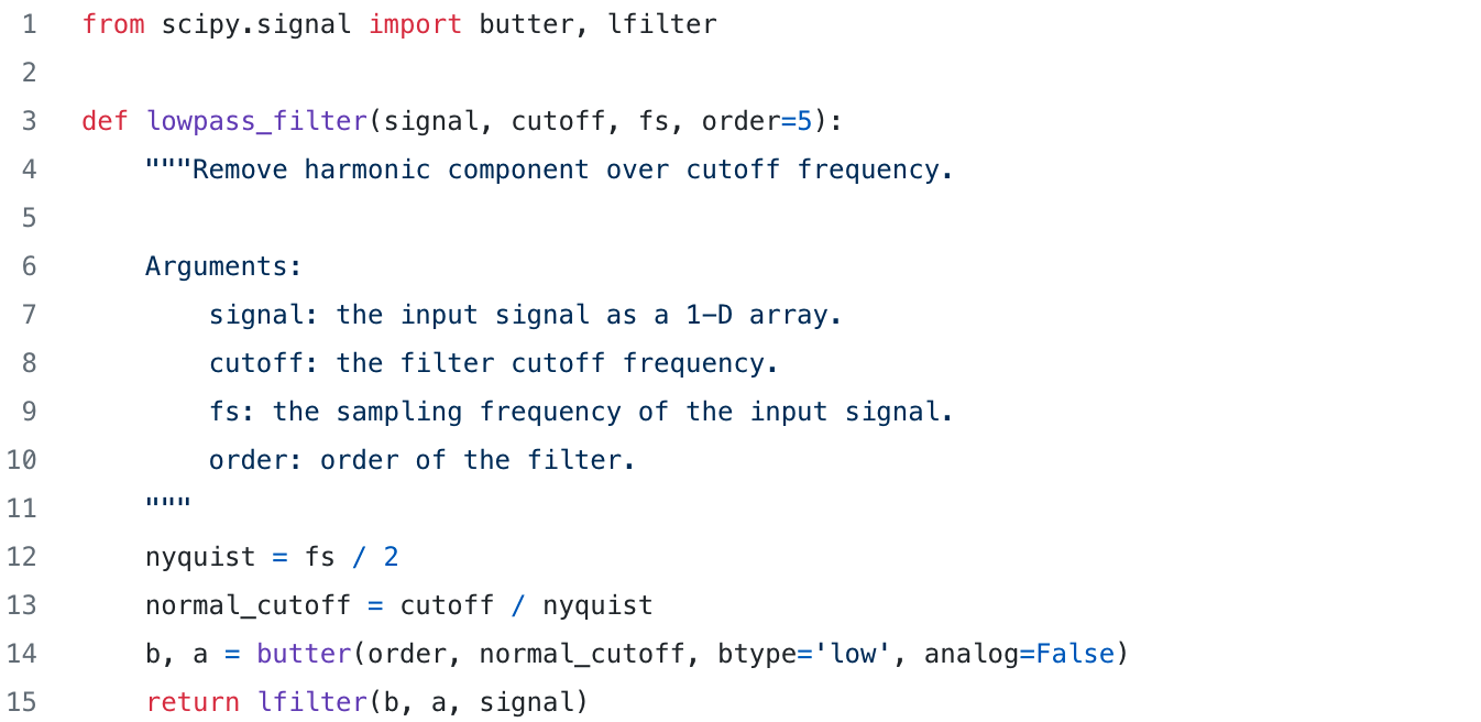
Figure 6 shows the same time series data from Figure 4 after removing the high-frequency noise using the filter from Snippet 2 with a cutoff frequency of 10 Hz. The 4 signals now look smooth.
Data Formatting and Normalization
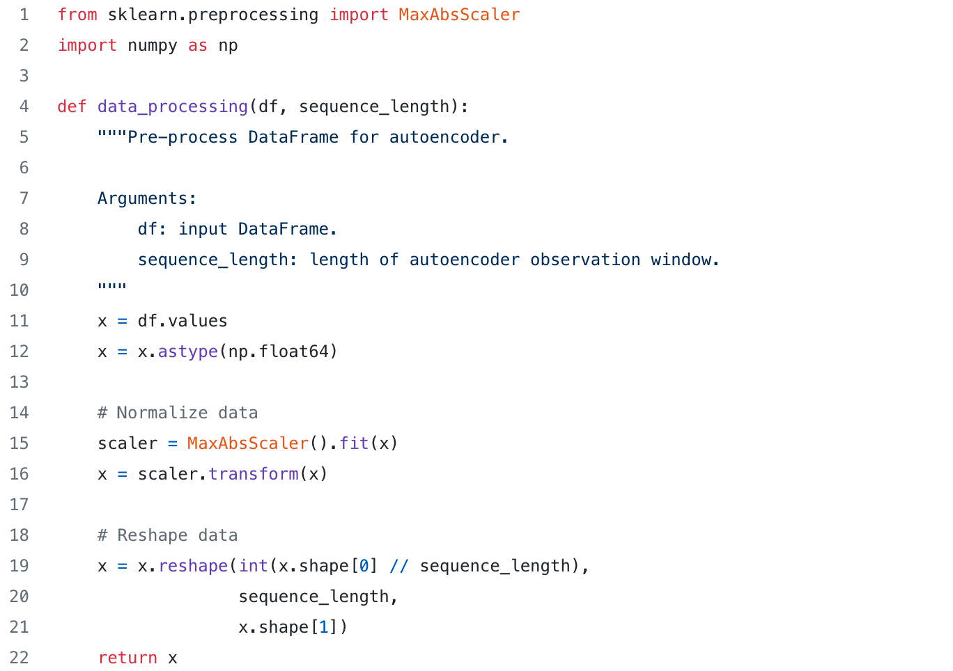
As previously stated, the autoencoder observes the time series data within a time window of fixed size (let’s call it S). At each point in time the autoencoder outputs the reconstruction error relative to the past S time steps. Consequently, in order to train the autoencoder, a dataset of sequences of length S has to be generated from the original time series data. Intuitively, having a sequence length of S time steps, the i-th sequence is generated using the data points from step i to step i + S -1 (assuming a stride of 1).
Additionally, the generated sequences are normalized in such a way that the amplitude of the 4 signals would span the range [0,1]. Normalization aims at avoiding that signals with a high amplitude would dominate the learning process — e.g., the autoencoder should learn how to reconstruct all 4 signals in the same manner.
Snippet 3 shows an implementation of the formatting and normalization steps described above. The shape of the resulting dataset is (N, S, M), where N is the number of sequences, S is the sequence length and M is the number of features (e.g., the number of signals).
Remember that only sequences showing normal behaviors should be used for training the autoencoder.
Training the Autoencoder
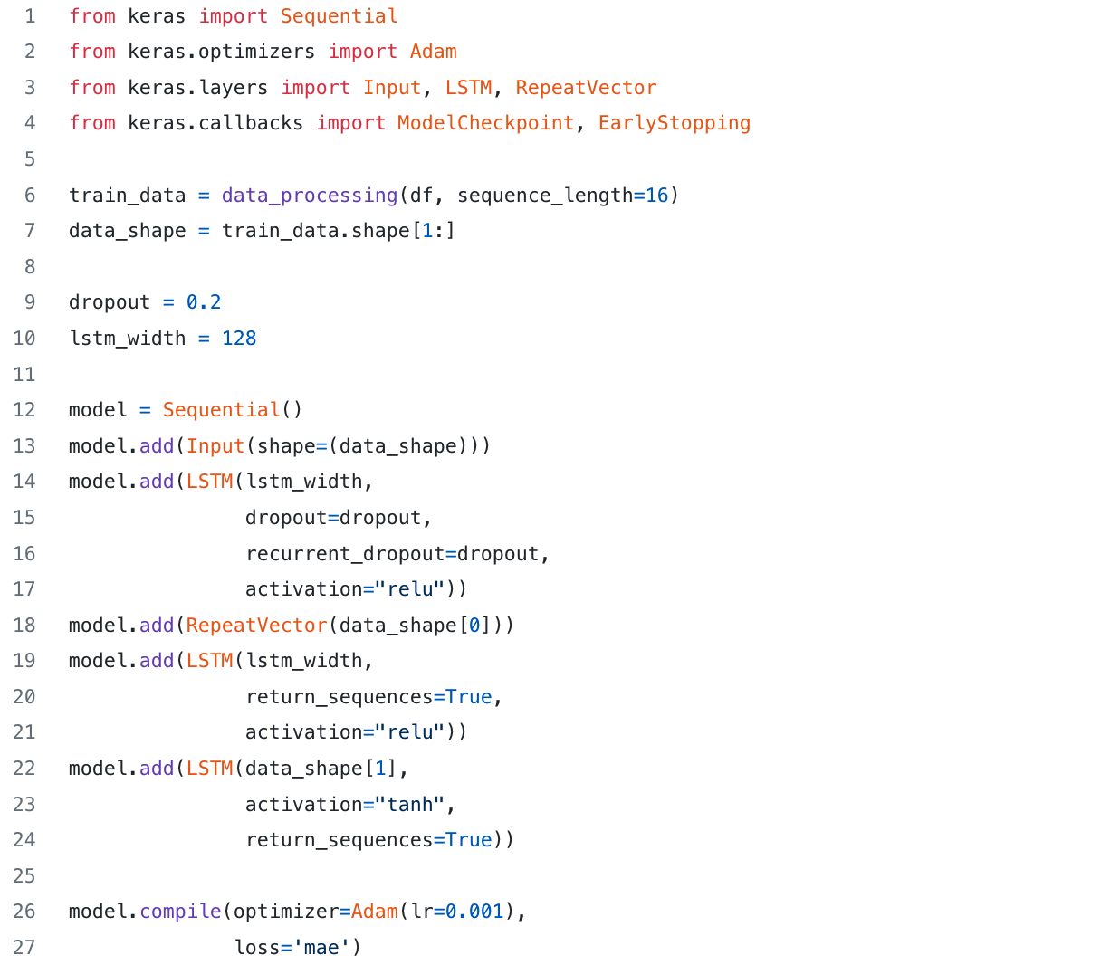
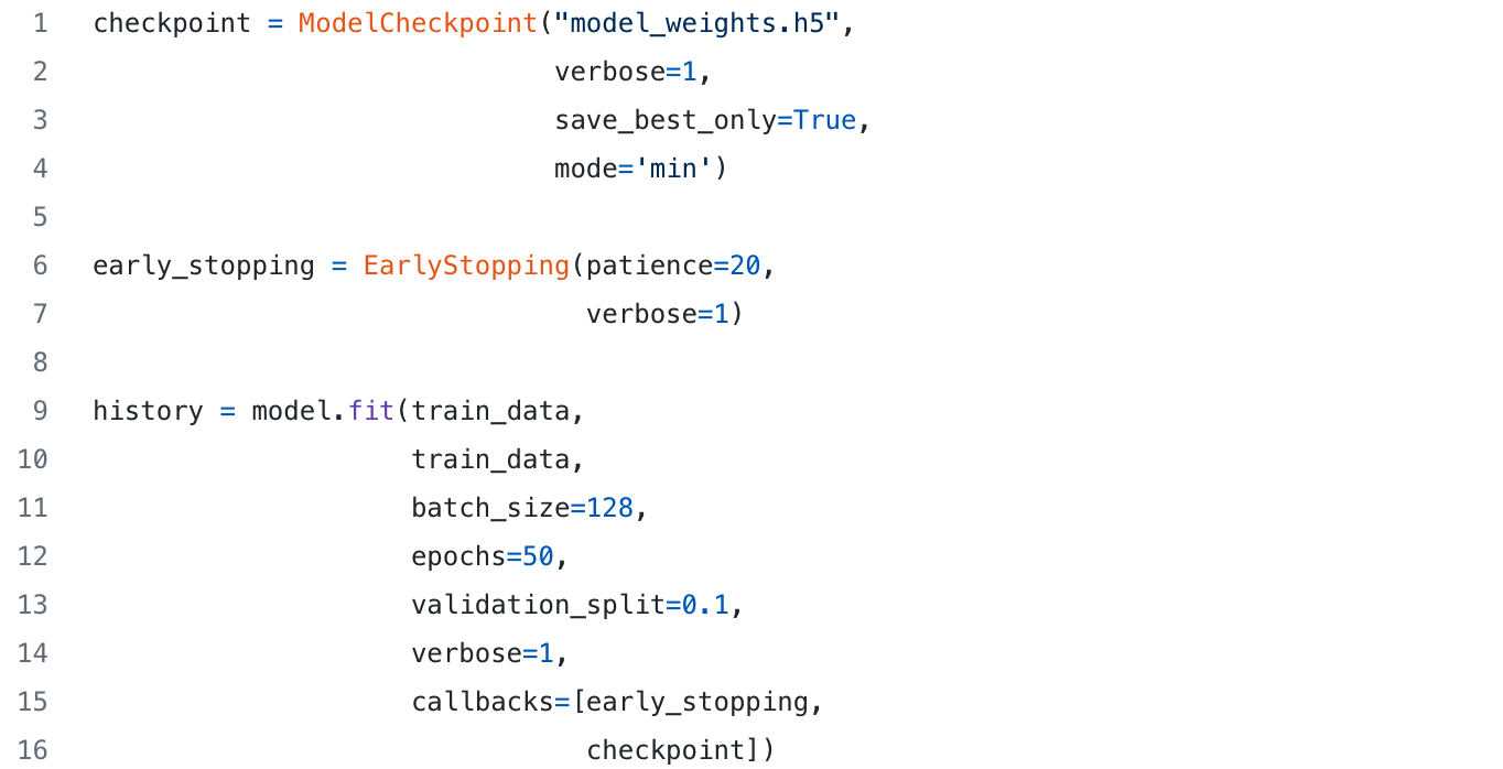
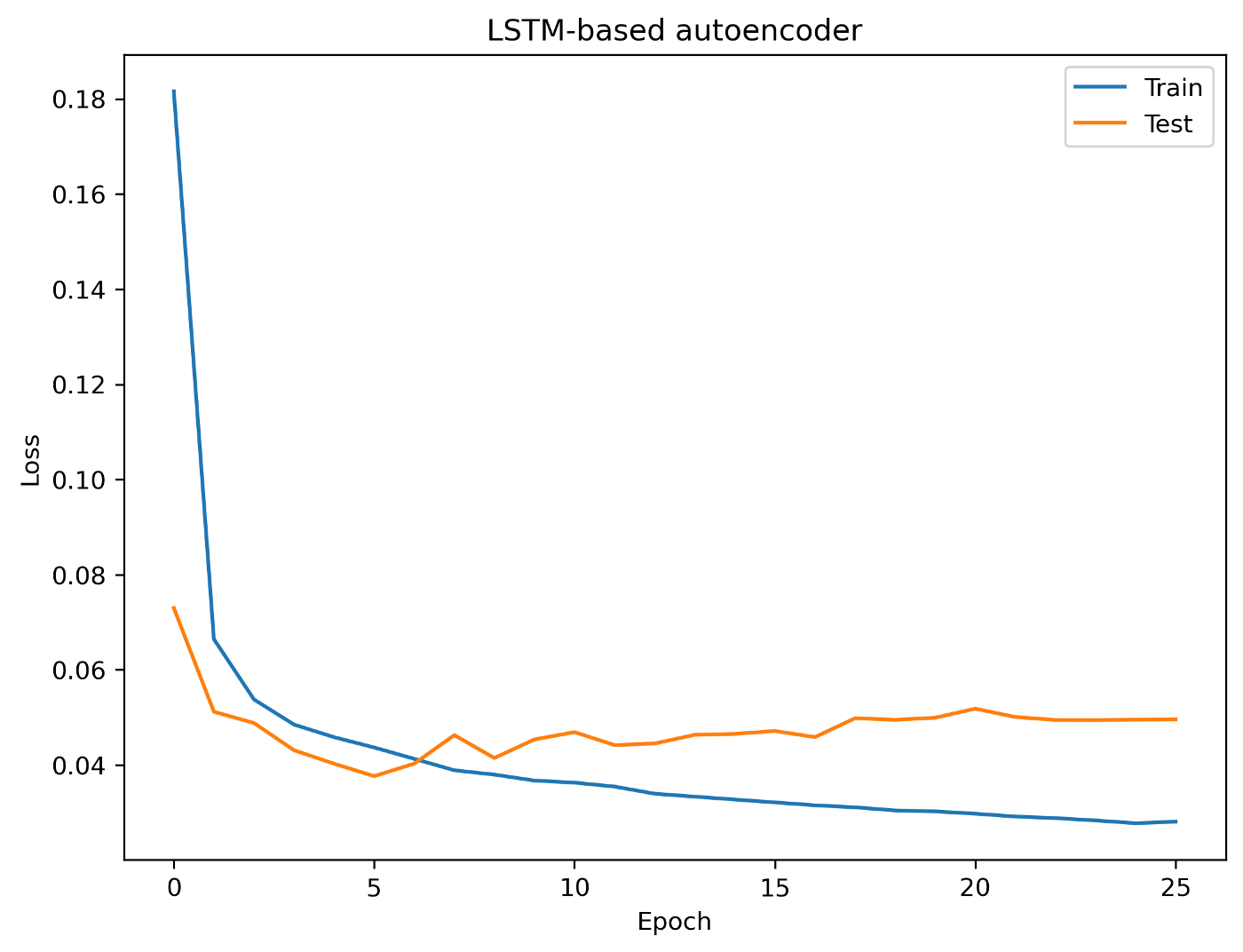
Snippet 4 defines the architecture of the LSTM-based autoencoder using the Keras Python package, while Snippet 5 runs the actual training. Figure 7 shows the training and validation losses over each epoch using 10,935 normal sequences of length 16. Ten percent of these sequences is used for validation with early stopping.
Performance Evaluation and Decision Logic
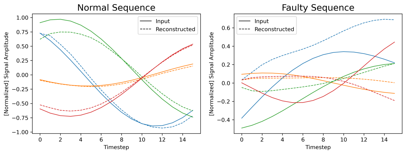
To visually assess the performance of the model, Figure 8 shows a comparison between two (randomly chosen) input sequences and their reconstructions made by the autoencoder. We can see that the autoencoder can reconstruct the normal sequence fairly well; but we cannot state the same for the faulty sequence.
During prediction, a threshold mechanism can be used to label the sequences as normal or faulty on the basis of the resulting MSE — e.g., when the error is lower than a fixed threshold the sequence is labelled as normal; when the error exceeds the threshold the sequence is labelled as faulty. Setting a proper threshold value is critical to minimize the misclassification rate.
The sequence length is another critical parameter determining a trade-off between accuracy and how quickly faulty patterns can be detected — the shorter the sequence, the faster the model can discriminate machine behaviors. For example, given a sequence of length S, the model needs to wait S time steps before being able to compute the corresponding error value — i.e., in the animation previously shown in Figure 2 the model had to wait 30 time steps before starting to make predictions.
Finally, Figure 9 shows the autoencoder at work.
Conclusion
I hope you enjoyed this quick journey through signal processing and autoencoders — the next time you will run into an anomaly detection problem, give it a try!
As a final note, keep in mind that the quality and effectiveness of your code are not the only relevant aspects in the interview process. Clarity of thought, thorough documentation, and a cohesive narrative are critical elements of a successful technical challenge submission. Combining a competent technical approach with a clear written and visual description of your work is a surefire way to impress!


